
Case study
Turning Rewards into a Product Growth Loop
view mode
collaborators
tech
brand
overview
Overview
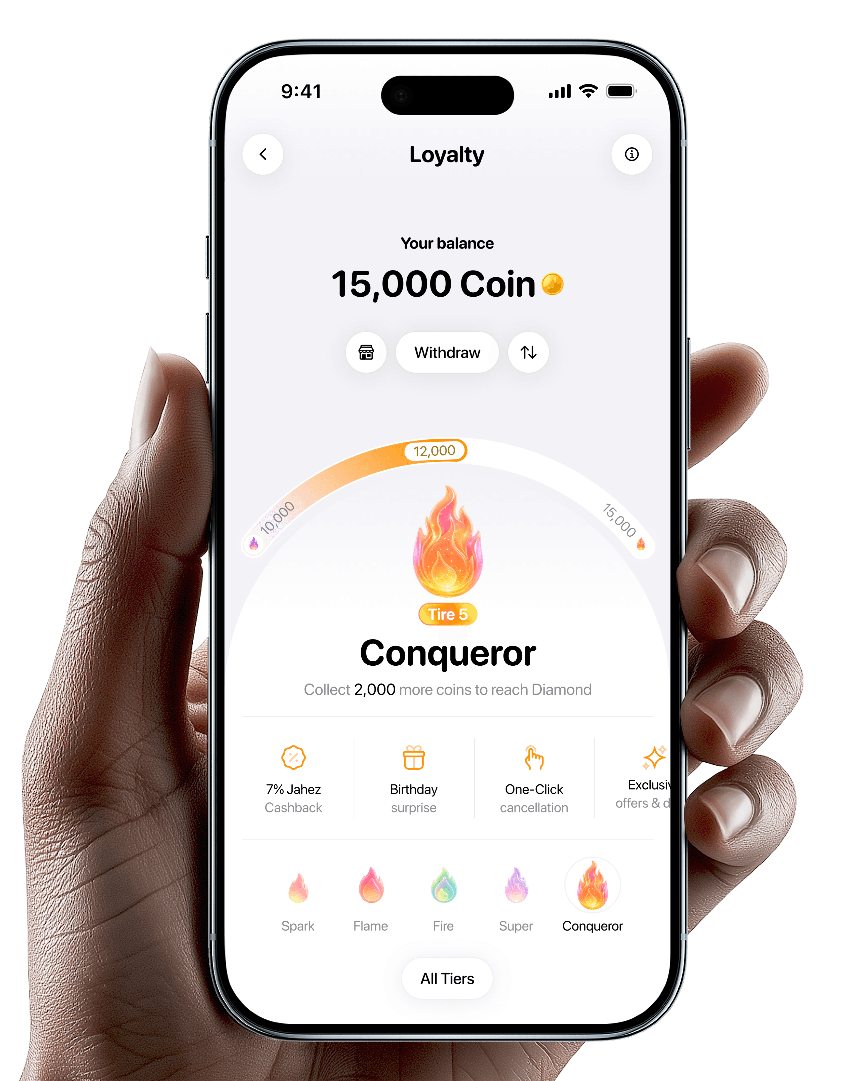
Jahez users order frequently, but the relationship between ordering and rewards was not always visible or motivating.
The goal was to design a loyalty program that makes every order feel valuable, gives users a clear reason to return, and creates a stronger emotional connection with the brand.

My role
I worked on the product experience, information hierarchy, interaction design, and visual direction for the loyalty program.
My focus was to make the system feel clear, motivating, and scalable. I explored how the loyalty home screen should communicate balance, tier status, progress, benefits, and future rewards in a way that users can understand quickly.
I also worked through multiple design iterations based on benchmarking, behavioral design principles, and feedback from product, design, and business stakeholders.
Making loyalty easy to join
Turning every order into visible value.

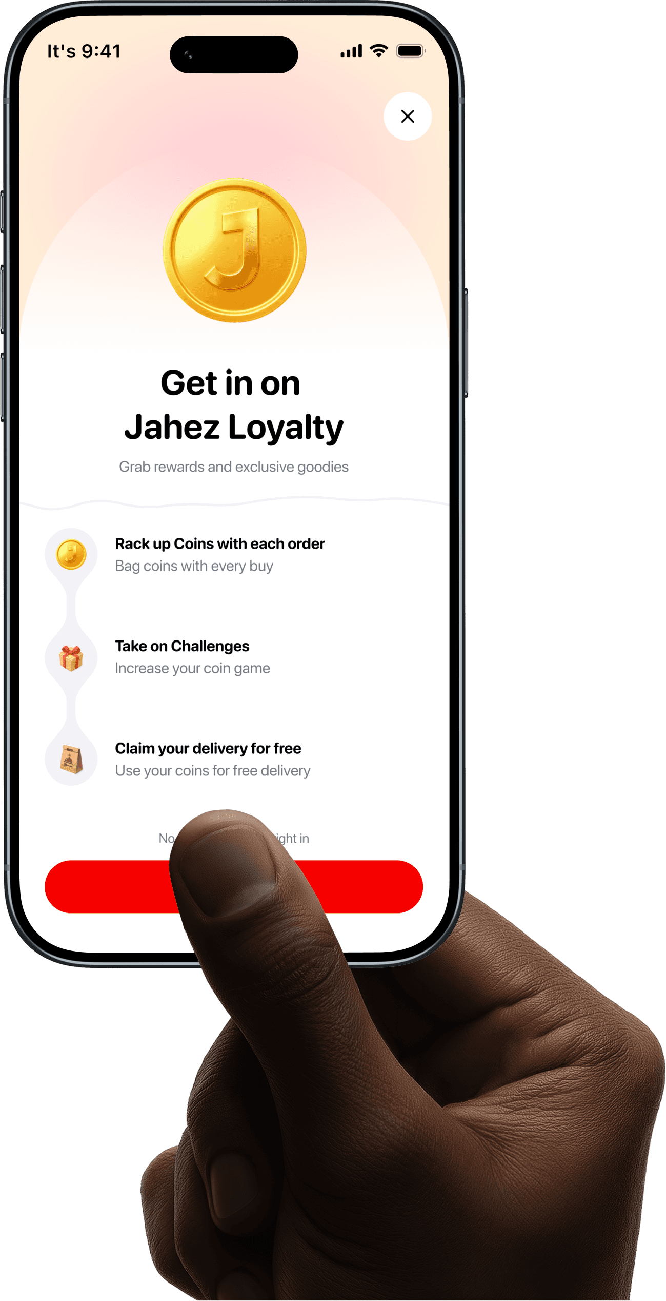
Making loyalty easy to join
A focused intro screen that explains the value before asking users to opt in.
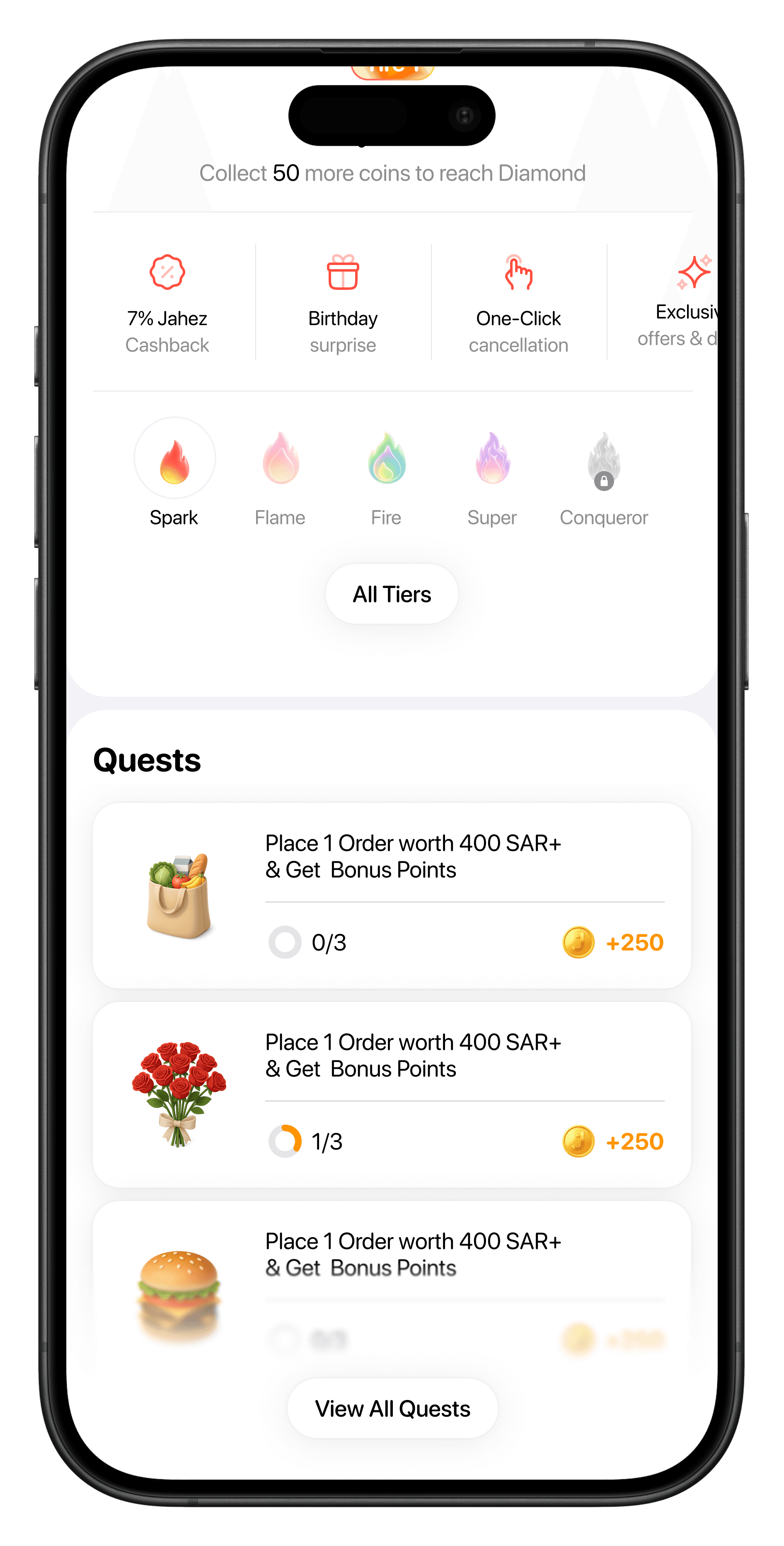
Loyalty Quests
Small challenges that encourage repeat ordering.
Design Goals
(1)
(2)
(3)
(4)
progress visible
emotional motivation
easy to understand
scalable system
Users should instantly understand where they are and how close they are to the next tier.
Tiers should feel aspirational, not just functional.
Cashback, gifts, and exclusive offers should be discoverable without overwhelming the screen.
The design should support more tiers, benefits, campaigns, and future loyalty mechanics.
Research and Benchmarking
Exploration
Option 1
Transaction-count-based cashback multiplier
In this model, users progress by completing orders. The more they order, the better their cashback multiplier becomes.
Example logic:
Complete orders to move forward.
Reach the next tier.
Unlock a higher cashback multiplier.
Use the reward on future orders.
This model is easy to understand because the behavior is simple: order more, unlock better value.
Option 1
Transaction-count-based cashback multiplier
In this model, users progress by completing orders. The more they order, the better their cashback multiplier becomes.
Example logic:
Complete orders to move forward.
Reach the next tier.
Unlock a higher cashback multiplier.
Use the reward on future orders.
This model is easy to understand because the behavior is simple: order more, unlock better value.
Design Goals
Research and Benchmarking
Exploration
I explored two main reward models.
Research & Benchmarking
Research &
Benchmarking
Research & Benchmarking
Brands

Brands
Brands
Brands
Join us now
First user story
Problem
After placing an order, users often experience uncertainty.
They want to know:
Has the restaurant accepted my order?
Is the food being prepared?
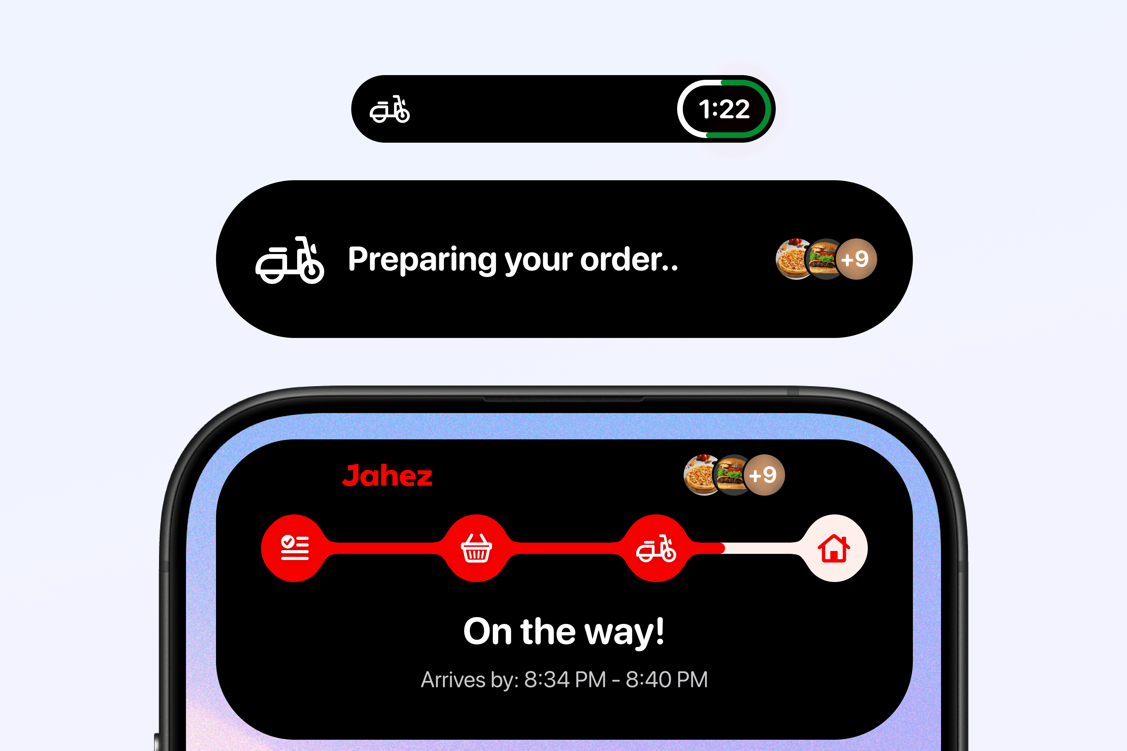
Is the courier on the way?
When will the order arrive?
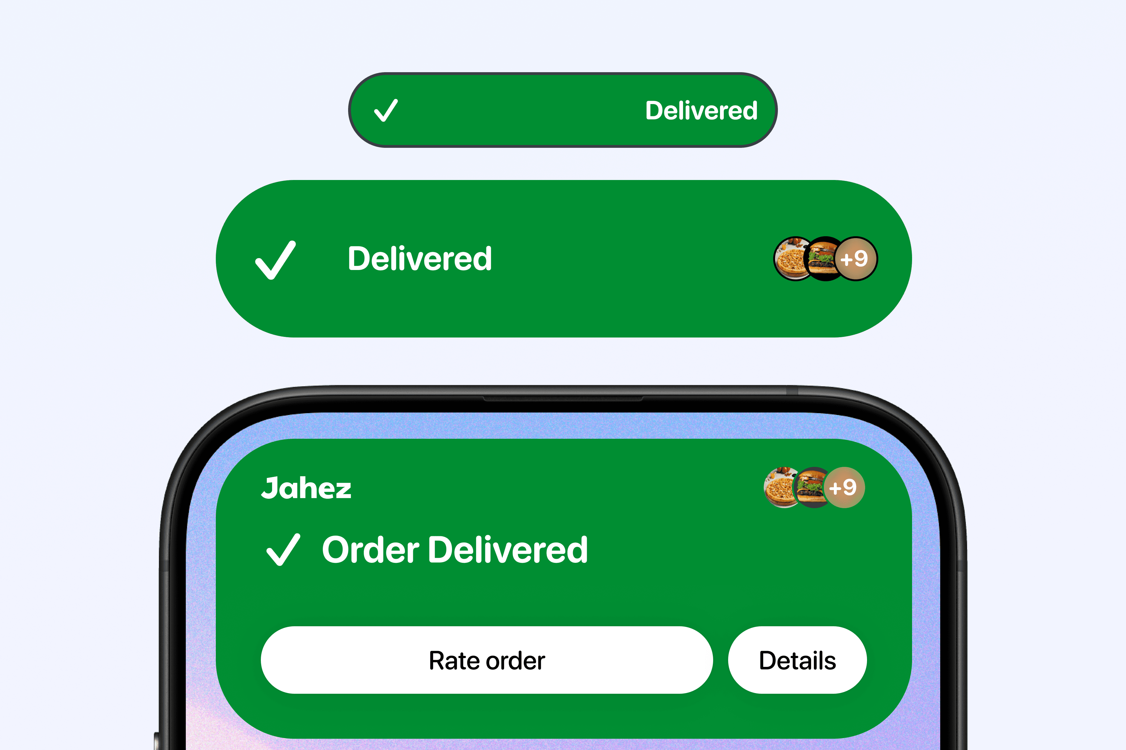
Has the order been delivered?
The existing in-app tracking experience can answer these questions, but it requires users to open the app repeatedly.
This creates unnecessary friction, especially when the user is multitasking, working, driving, or using other apps.
The challenge was to design an experience that keeps users updated without interrupting what they are doing.
Starting Point
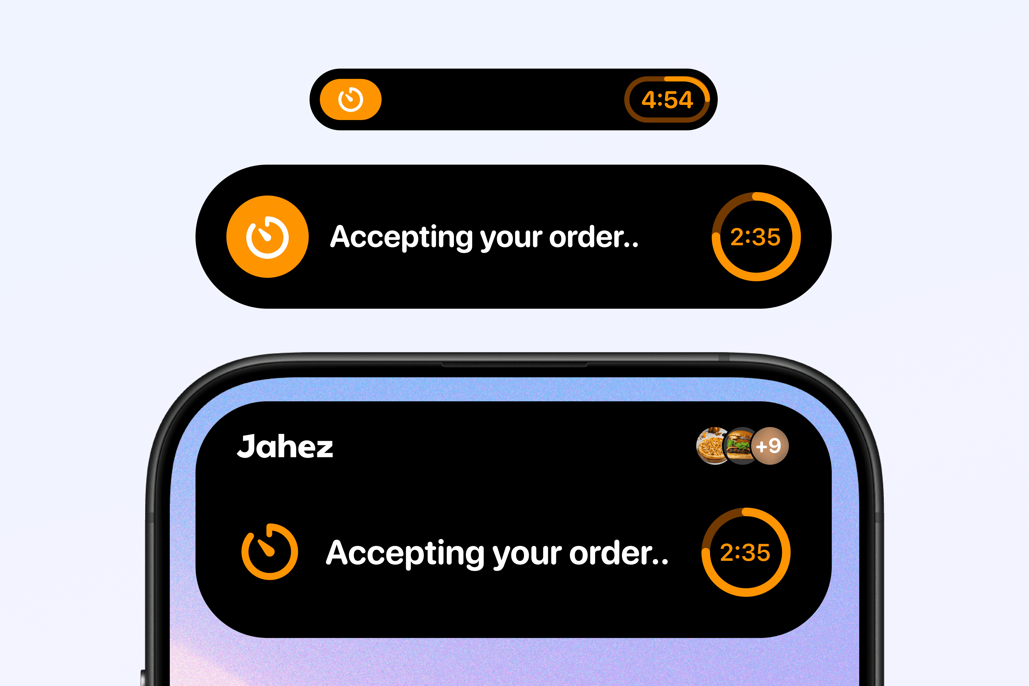
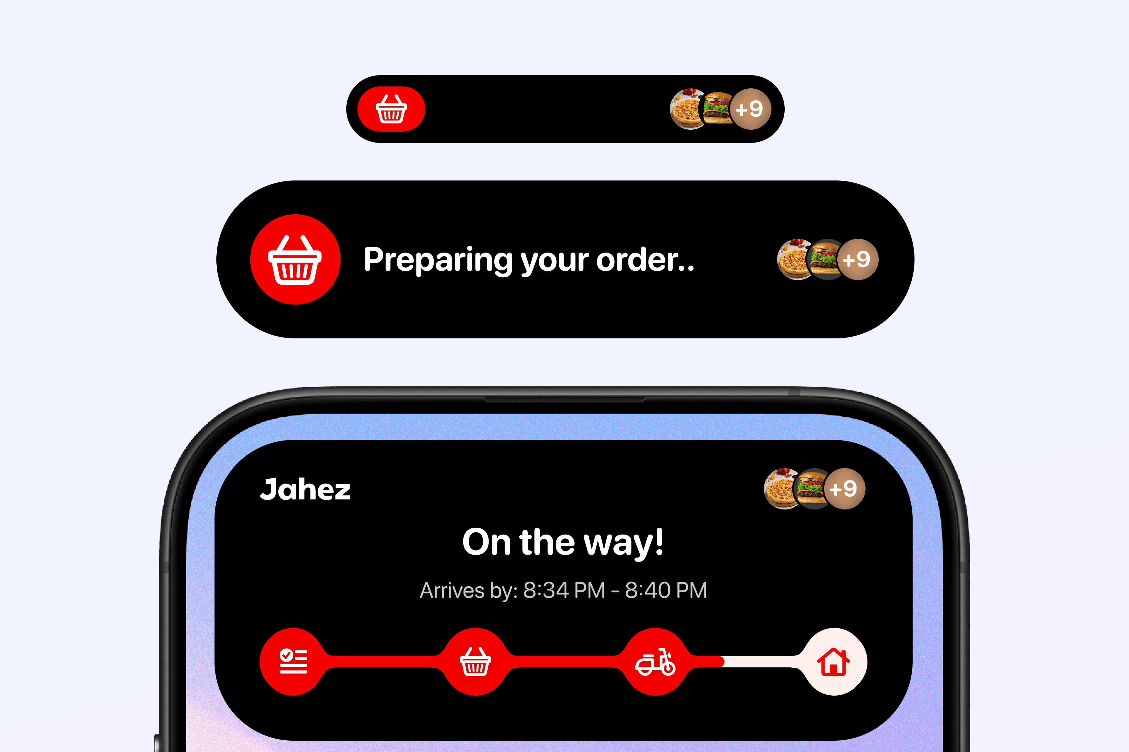
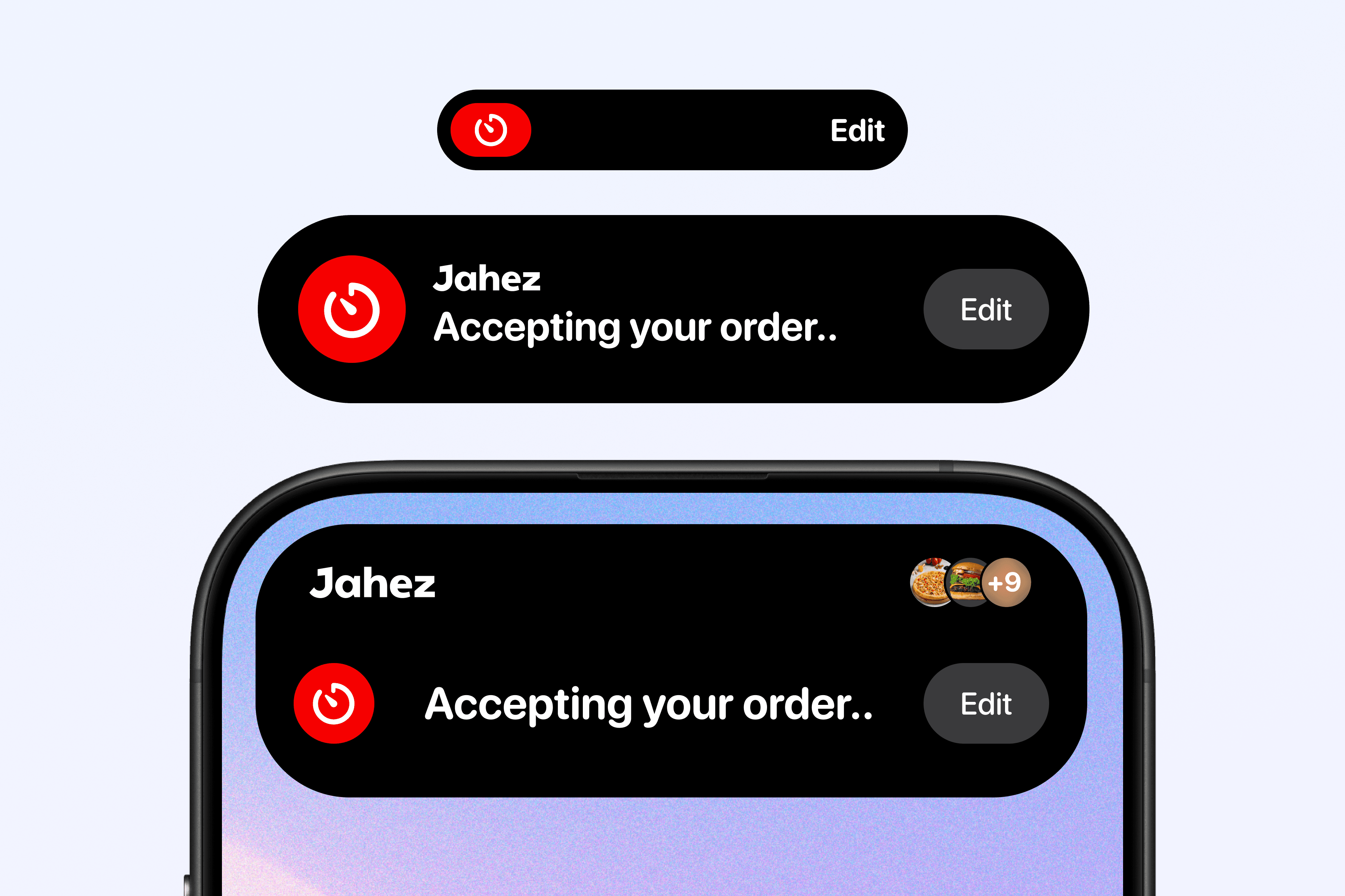
The first direction focused on showing the order status in a compact Dynamic Island layout.
The main goal was to answer one question quickly:
What is happening with my order right now?
At this stage, the UI included:
Jahez brand label
Current order status
Small order/customer indicators
Basic action area
The design worked as a first pass, but it needed stronger hierarchy and clearer progression between order stages.
● Case study